Anatomy of a Statue Edit
By Panic
Day One
So here it is. A promise made years ago will finally be realized. First,
I'd like to state right off the bat that there are thousands of ways to accomplish
the illusion of a person turning to stone. I've personally crafted dozens,
perhaps hundreds, of edits, and each one has proved to be singularly unique,
both in planning and execution. In truth, I believe the process of creation
mandates this as a necessity. Let's face it, the human mind typically despises
monotony. However, what I will attempt to do with this basic statue tutorial
is explain my process with the goal that you'll find the exercise eye-opening.
I don't have any doubts that you can produce amazing artwork. Perhaps this
will help you get started in the right direction.
Now, for this lesson I will be using a program from Jasc Software called
Paint Shop Pro, version 5.02, to be precise. Believe it or not, this build
of PSP is already several years old. If I had the resources financially,
I'd love to pick up the latest, which is now up to 7.0. However, don't fret.
While a few of the toggles and options will have a slightly different look
or feel, I assure you that the concepts will undoubtedly remain the same.
I have had much experience with PSP 6.0, and let me tell you, there are many
exciting features built in that make it a great improvement over 5.02. I
shutter at the possibilities of what Jasc has done with 7.0. And, I would
like to mention that if anybody from Jasc does happen to catch this tutorial
on using their product, please consider a worthwhile donation of one (1)
free version of 7.0 fully licensed to Panic Attack Productions.
Now, you may be asking, "Where can I get my hands on Paint Shop Pro?" Well,
lucky soul, you can download a limited trial of PSP 7.0 to use for 30 days.
All of the features are available during the limited trial period, so you're
not getting a stripped-down version. Point your browser to the Jasc Software website, which I've conveniently
linked for you to visit. The main reason I haven't done so and upgraded for
this tutorial is simple: I don't want to screw up my licensed copy of PSP
5.02 currently residing on my hard drive.
Lesson One: Selecting the Perfect Picture
Okay. So, you're ready to dive in. Now the question becomes, what do I want
to do? Well, if you're still with me this far, I'm assuming you'd like to
turn a person to stone. No judgements here; I happen to find lady statues
a favorite, so that's what I do. Yet, you may want to do something different.
More power to you. The simple fact of the matter is, you can pretty much
do whatever you'd like. Freedom, baby, freedom! However, there are several
criteria you may want to consider before putting several hours into a project
that may yield results that aren't satisfactory to you.
In my experience, I've found more often than not that the resolution of a
picture makes a huge difference to the quality of a finished product. The
simple addage, "shit in, shit out" applies. So, if you have a picture you've
fallen in love with that happens to be 100 pixels by 60 pixels, be ready
for a bit of heartbreak. Sure, you could try to blow that motha up, but you'll
get something that looks a lot like a train wreck: big, blocky pixels everywhere.
Sorta shatters the illusion you're trying to present, doesn't it? Another
important factor before even sliding the mouse is clarity. Is the image sharp
or is it blurry? There are a few filters that can sharpen images up, but
they are also limited by the source material. So, make a choice. Before you
get intimate with an image you plan on working on for serveral hours, decide
whether its size, quality and clarity are worthy of your efforts. Typically,
promo pics from some websites are doing just what they are designed to do:
show just enough to get you to order access, but they aren't trying to give
everything away, you know? I have found some luck finding images I like on
newsgroups, but even they are drying up a bit since most ISP's are doing
more filtering. You get what you pay for, it seems. For a quality pay newsgroup
service that presents everything posted, I've been told that Giganews is a quality pay service. Also,
bear in mind that the future of pictures on newsgroups is a form of compression
called yENC, which requires decompression. So, you may need a program such
as NewsShark to grab these
compressed files and convert them into something you can use.
If you would like to try your hand at this without filling a hard drive full
of photos, why not head over to my page of 'To Be Edited (TBE)" photos on
The Medusa Realm.
Now, I want you to be honest with yourself. Focus on what most excites you
about the subject you will be working on. You may like certain physical attributes
about a model, or like her pose or expression. You may be somebody who's
into long, flowing hair and firm breasts. Or tatoos may float your boat.
Well, you know what, your unique approach is the first individual step in
the editing process. That's right! You're shaping the work before you really
get to work on anything just by selecting something that turns you on. All
I can add is this: choose wisely. Be honest with yourself, since the end
results will be far more rewarding if you are able to live out your fantasy
of capturing that one perfect moment in stone that you've always dreamed
about.
If you happen to get lucky and find an entire series of pictures that get
the creative juices flowing, then it's time to do a happy dance around your
PC, since you'll have far more options down the road, which I'll get into
with greater detail once we've gotten started.
Removing a Marker
If you've found a wonderful, high-resolution image, but are dismayed by a
nagging marker from the host website embedded in the image, don't worry.
Here's a quick way of fixing such a problem in most cases.
More often than not, by recropping an image, you can weed out that frustrating
logo that you don't want invading your eventual work. The crop button looks
like this and can be found here on the toolbar:

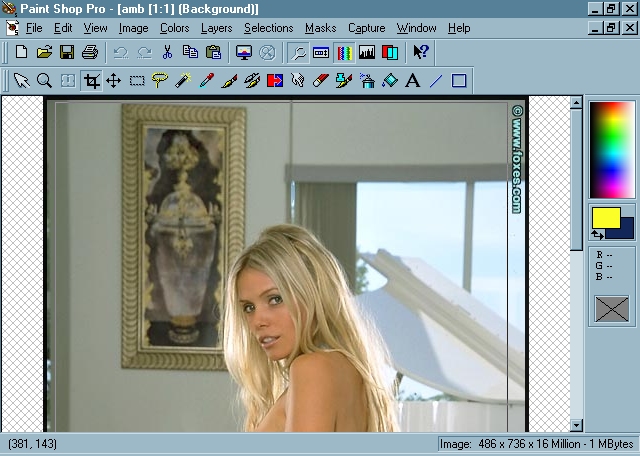
Notice the annoying black border and that nag for foxes.com... I can't imagine
NOT getting rid of that intrusion before putting so much work into this.
So, simply click the crop button (circled above), then left click and drag
the mouse, leaving everything you wish to remain inside the box. Example:
Notice how easily that branding and the border can be eliminated? Two things
to bear in mind when considering a crop: 1) try to keep your focus centered
and crisp. Notice the picture frame above her? I wanted to keep a clean line
towards the top, so I kept that left corner. Try to stick with what's pleasing
to the eye, and pay attention to the way your eye moves around an image.
2) try not to trim any part of your model. I'm a firm believer in keeping
your image intact. Don't throw out the babe with the bathwater.
Now, if you find problem #2 in the paragraph above to be unavoidable due
to the location of the brand, there's another option: the miracle known as
the "clone" brush. Don't let this powerful little tool intimidate you; it
can be your long, lost friend. The concept of the clone brush is a simple
one. It will reproduce a selected area within an image, or even between two
images. Sounds tricky, doesn't it. Well, I assure you, it's not. When you
want to clone, simply select the clone brush:
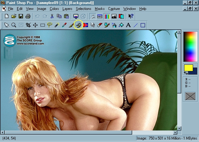
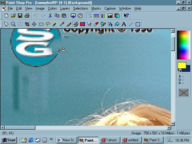
See that dreadful logo? Well, why don't we just clone that puppy right outta
there? Now, before you can start with this, you must understand a few principles.
Firstly, you need to know how the control panel works. You can adjust the
transparency level by sliding the toggle left or right, or by typing a percentage
into the box. If you don't see your control panel, simply click the icon
on the toolbar circled below:
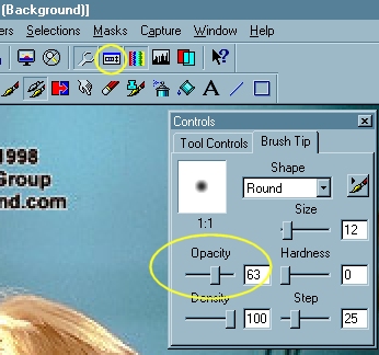
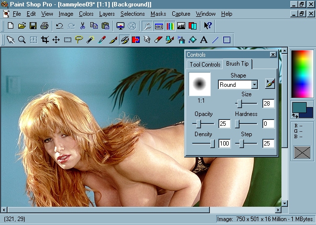
As you can see, you have a ton of options at your disposal. I most often
use the size and opacity toggles, but you should feel free to play until
you can achieve the desired effect you're looking for. As you make adjustments,
you will be able to see the resulting changes in the little white box. That
will be your spray pattern.
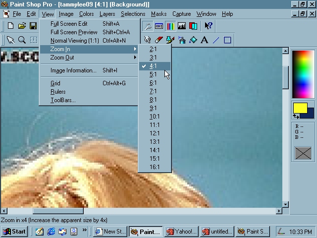
Another quick lesson is on viewing your image. You can quickly and easily
adjust the viewing size of your image by clicking view above the toolbar.
This is advantageous when zooming in to do fine details that require precision,
and also when you are zooming out to view your art as a whole. Here's an
example:
Now that we have a good close look at things, let's use the clone brush.
Since we want to maintain a uniform light source, we'll want to right click
just below the logo, then move the mouse directly up before painting a clone
of the infected area:
Pretty magical little tool, huh? See that little multiplication sign? That's
the area being sampled. Now, sometimes, you may notice subtle repeating textures
that will distract the area. I found that to happen in this instance as well.
When this happens, I reduce my opacity to about 20%, increase my brush size
to about 35 pixels, then I'll select areas to the right or left and spraypaint
the clone brush until everything looks smooth and even. Here's the final
result:
Look at that! Incredible, huh? As if the logo never existed in the first
place! You may find artifacts on your picture such as dust or hairs. You
can see that the clone brush can be the optimum tool for cleaning up many
imperfections within an image.
So, this will be your homework for tonight. I want you to search for your
first picture to edit. You may already have a few on your hard drive. Or,
check out the TBE pages (Page One or
Page Two) for a few of my personal
favorites. Once you find a picture you are inspired to work on, I want you
to open it and play. Use the crop tool once or twice to get the feel of it.
Crop the head off once perhaps or tighten the subject as close as possible.
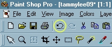
Each crop can be undone by clicking the undo button shown below:
Later versions of PSP will remember several dozen of your last commands,
allowing you to undo countless mistakes. If you are using PSP 5 like I am,
you will need to save your work more often, since PSP can only recall a few
of the most recent commands. In this way, PSP has advanced significantly
in subsequent versions. One other annoying aspect of PSP 5 is the fact that
brush strokes aren't counted separately. What this means is: even if it takes
you twenty brush strokes to clone out that logo, but on the last stroke you
made a mistake, hitting undo will clear all of it, not just the last stroke.
Very frustrating, and good reason to start with a higher version of Paint
Shop Pro if you need to do a lot of undoing.
Your final bit of homework will be to experiment with the clone brush. Try
anything you can think of to do with it, since this tool is too powerful
to ignore. I guarantee you, the clone brush will likely become the most prized
tool within your bag of tricks when polishing your craft.
To reiterate:
1) Select the picture you wish to begin your next lesson with.
2) Attempt to successfully use the crop tool.
3) Experiment with the clone brush. Don't forget to make adjustments in the
control panel to tweak the brush size and opacity. You will be surprised
how fluid the entire process can be after a few dozen attempts.
As you are tearing up a picture, please remember, you will NOT want to save
your butchery in place of the original image. A general rule to follow is
this: don't save unless it is of benefit. I want you to get familiar with
these two tools (clone and crop) since your progress will grow from there.
However, I can't stress enough how important it is to use your own common
sense, since you can't undo a save. You can backtrack and undo commands leading
up to an accidental save then re-save, but try to be careful. Most headaches
can be avoided. What I'm trying to tell you is don't save over your selected
picture, even if you have done something productive, such as removing a brand.
You can never go wrong by clicking "save as" and saving a new version.
And that shall conclude the lesson for today. I thank you for deciding to
join this electronic lecture. Class is dismissed.